3.3
Design and Planning Documents
These are the documents that tell a production team what to make and how it should work. The exam gives you a draft and asks you to improve it, and the marks go to answers that name what a specific person could not do with it as it stands.
On this page11 sectionsHide
- Read the named user first
- Which document does this person need?
- Asset logs: knowing what you have and whether you can use it
- Flow charts: every route, including the one back
- Scripts: words, performance and everything around them
- Storyboards: a sequence somebody else has to shoot
- Visualisation diagram or wireframe?
- Turning what you can see into a mark
- Key takeaways
- Glossary
- Test yourself
What you need to know
- Know all six documents and what goes in each.
- Explain which production role uses each one, and why.
- Evaluate what is actually in the figure instead of reciting a checklist.
- Improve a supplied document using the right conventions and useful annotations.
Start here
Read the named user first
These documents exist so nobody has to guess once production starts. The client may approve them; the specialists work from them. Which is why the first thing to read in the question is who it is for. A camera operator needs shot instructions. A video editor needs sequence, timing and transitions. The same storyboard has to serve both.
Hand drawn or digital both work. Word processing suits a script, a spreadsheet suits an asset log, drawing or diagram software suits layouts and flow charts. A graphics tablet helps with drawing; a camera or scanner brings reference material in. Pick the tool from what the document needs to do.
Try it
Which document does this person need?
Ten jobs, eight documents. Visualisation against wireframe is the pair that costs the most marks, so it comes up more than once.
Learn the list
Asset logs: knowing what you have and whether you can use it
An asset log is a structured record of your material — images, audio, video. Useful columns are an asset name or ID, a description, the file type, where it is stored, where it came from, who made it, the permission or licence, and any edits still needed.
For a travel video, one row might read “harbour-ambience.wav”, the sound recordist, the project folder, and “trim the first five seconds”. Compare that with a row saying “sound from internet”, which gives an editor no file to find and no evidence anyone is allowed to use it. Writing down a source is not the same as holding a licence.
Learn the list
Flow charts: every route, including the one back
An interactive museum display might ask “Has the visitor chosen a language?” Yes opens the menu; No goes back to language selection. A developer needs connected arrows, readable labels and every branch completed, because an unlabelled branch is a route they will have to invent.
A flow chart describes behaviour, not appearance. What the screen looks like is a different document’s job.
| Symbol | What it means |
|---|---|
| Oval or rounded rectangle | Start or end of the process. |
| Rectangle | A process or action. |
| Diamond | A decision, with labelled branches such as Yes and No. |
| Parallelogram | Input or output, where relevant. |
| Arrows | The direction and order of the flow. |
Read the figure
Scripts: words, performance and everything around them
A script can carry a title, scene numbers, the location, whether it is interior or exterior, action, character names, dialogue, delivery directions, sound cues and timing. Exactly which of those it needs depends on the product — a radio advert has no shots but still needs clear speech and sound instructions.
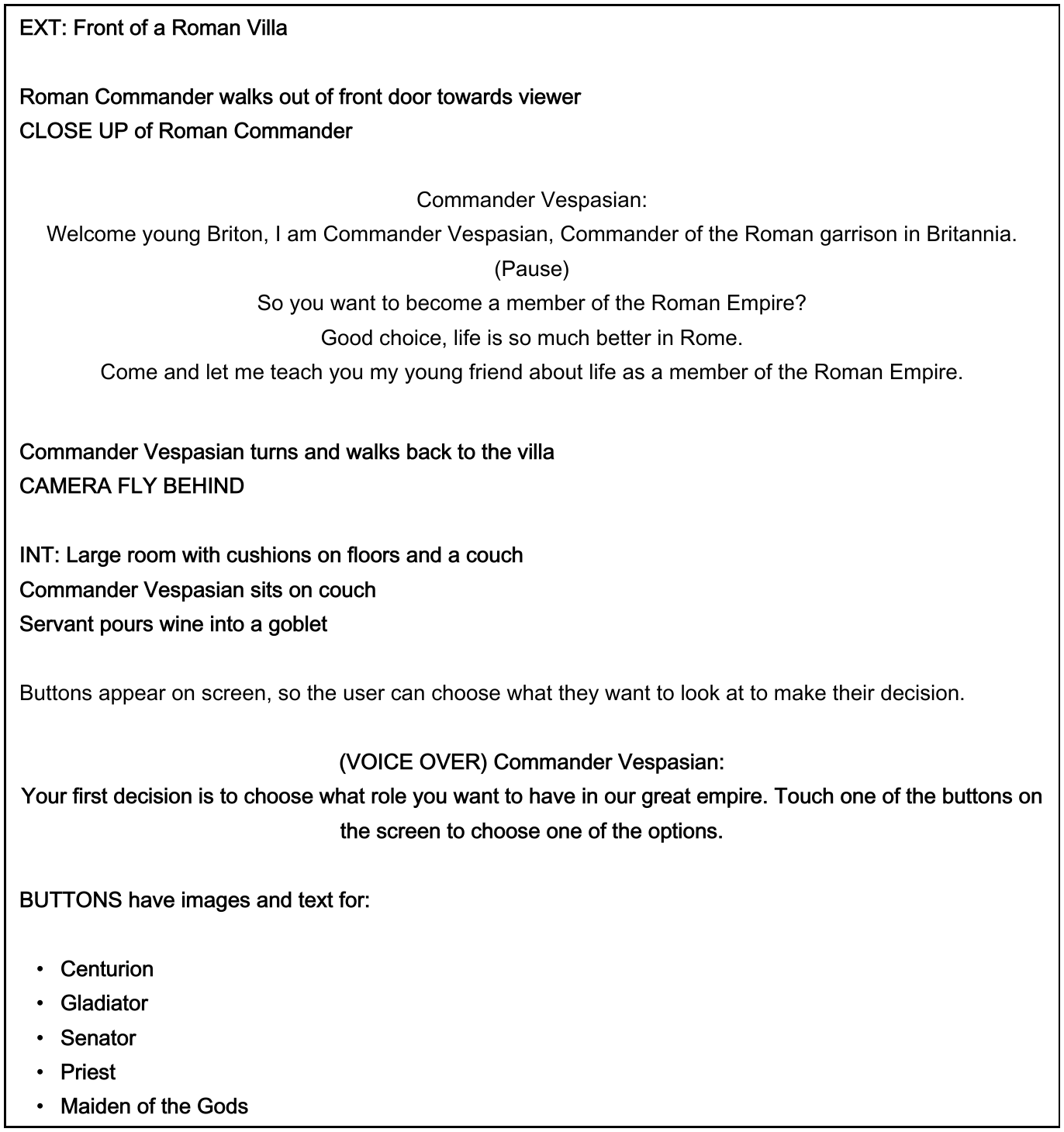
1.EXT tells you where you are
EXT means exterior — this scene is outdoors, in front of a Roman villa. Later the script switches to INT for an interior. The crew needs that before they can plan lighting or sound.
- EXT tells you where you are. EXT means exterior — this scene is outdoors, in front of a Roman villa. Later the script switches to INT for an interior. The crew needs that before they can plan lighting or sound.
- A camera instruction, inside the script. “CLOSE UP of Roman Commander” is a shot type sitting in the middle of a script. This is the evidence that a script carries more than dialogue.
- Who says it. The speaker’s name sits above their lines so an actor can find their own dialogue without reading the whole page.
- How to say it. “(Pause)” is a performance direction — it changes the delivery, not the words. “Whisper, urgently” would do the same job.
- A camera movement. “CAMERA FLY BEHIND” tells the operator the camera moves as the Commander walks away. Compare it with the earlier close-up, which was framing rather than movement.
- This one plans an interactive product. The voice-over and the on-screen buttons are what make this an interactive media script rather than a film script. It is planning what the user does next, not just what they watch.
For an audio drama, put the speaker’s name beside every line and mark where the door sound happens. Actors then know which lines are theirs, and the sound technician knows when to trigger the effect. “Whisper, urgently” tells them more than “speak” ever will.
Read the figure
Storyboards: a sequence somebody else has to shoot
A storyboard is ordered panels with sketches and annotations. The conventions worth knowing are scene or shot number, shot type, camera angle, camera movement, action, duration, lighting, sound and transitions.
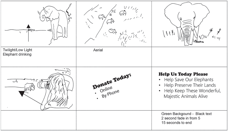
1.Panel 1 — a start, but not enough
“Twilight/Low Light. Elephant drinking” gives lighting and action. It does not give a shot type, a camera angle or a duration, so the operator still has to guess how to frame it and how long to hold it.
- Panel 1 — a start, but not enough. “Twilight/Low Light. Elephant drinking” gives lighting and action. It does not give a shot type, a camera angle or a duration, so the operator still has to guess how to frame it and how long to hold it.
- Panel 2 — one word. “Aerial” tells you roughly where the camera is and nothing else. No duration, no movement, no indication of what happens during the shot.
- Panel 3 — completely blank. A close-up of an elephant with an empty notes row. Everything a camera operator needs is missing: shot type, angle, movement, duration, sound.
- These two are graphics, not filming. The last two panels are text graphics. They need a graphic designer and an editor, not a camera crew — so an improvement that adds camera angles here would be aimed at the wrong person.
- Panel 6 — the standard to copy. This is the only panel with timing: “2 second fade in from 5, 15 seconds to end”, plus the colours. That is what every other notes row should look like, and it names the transition an editor needs.
Different readers want different things from the same panel. “Close-up, eye-level, static camera” is for the camera operator. “Hold for four seconds, then dissolve to shot 3” is for the editor. When a question names one of them, answer for that one.
Improve the panel, not the drawing
Nobody gets marks for redrawing an elephant. Add the shot type, angle, duration and transition to the notes row — that is the information the production actually runs on.
Read the figure
Visualisation diagram or wireframe?
A visualisation for a cycling poster shows the rider illustration, the green background and a prominent event date — it is trying to look like the finished thing. A wireframe for the booking page instead labels the hero-image placeholder, the menu links and the booking button. Same project, different question.
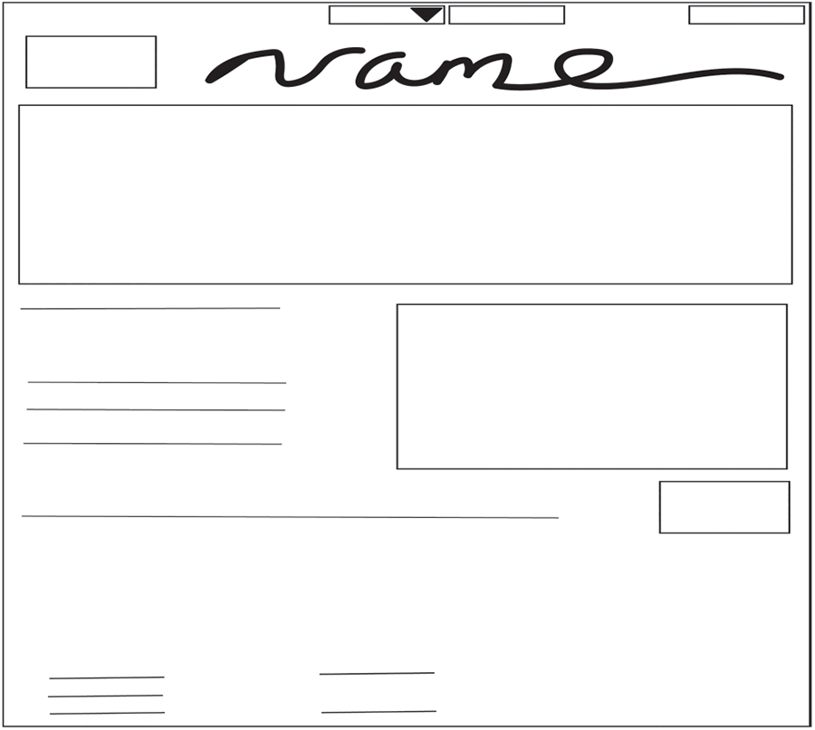
1.Navigation with no labels
Three boxes across the top and one has a dropdown arrow — so it is a menu. Nothing says what the menu items are or where they go. Label each one and the developer can build it.
- Navigation with no labels. Three boxes across the top and one has a dropdown arrow — so it is a menu. Nothing says what the menu items are or where they go. Label each one and the developer can build it.
- An unlabelled logo box. The box beside the handwritten name is presumably the logo, but a wireframe should not make anyone presume. Label it, and note which file it uses.
- The biggest element says nothing. This banner takes up a quarter of the page and gives no clue whether it holds an image, a video or a rotating slideshow. That is a decision the developer would have to invent.
- Image placeholder, no note. A box next to body text, with nothing saying what image belongs there or how it relates to the text beside it.
- Probably a button. A small box on its own usually means a button — but a developer needs the wording on it and where it goes when clicked. Add both, and this becomes buildable.
Wireframes can carry notes about sizing or style, but filling one with finished artwork turns it into a different document. When you are asked to improve a wireframe, keep the placeholders and add the labels.
| Document | What goes in it | Who it is for |
|---|---|---|
| Visualisation diagram | Sketches of the content, colours, typography, positioning, size and notes. | Shows a designer or client how the finished poster, graphic or interface should look. |
| Wireframe layout | Boxes and placeholders for images, headings, navigation, text and buttons. | Shows a web developer the structure, the hierarchy and what each element does. |
The thing that gets confused
Visualisation = how it looks. Wireframe = how it is arranged and what each part does. If your improvement adds colours and photographs to a wireframe, you have answered for the wrong document.
In the exam
Turning what you can see into a mark
That is the shape every evaluation point should take: evidence, then the specific change, then the effect on the named person. Longer answers want a range — a strength as well as weaknesses — and when you are completing a supplied document, put the improvements on the document itself with clear annotations.
Worked answer
4 marks
Evaluate the suitability of the storyboard above for the camera operator filming this campaign.
Tempting, but this does not score
The storyboard is not very detailed and the drawings are quite rough, so it should have more information added to make it better for the camera operator.
“More information” is not an improvement — it never says what information. And the quality of the sketches is not what a camera operator is short of.
Worth writing
Four of the six notes rows are blank, and panel 3 shows a close-up of an elephant with nothing written beneath it, so the operator has no shot type, angle or duration for it. Adding “close-up, eye-level, hold 4 seconds” to each panel would let them frame and time the shot without stopping to ask. Panel 6 already does this — it gives a fade timing and a total duration — so it shows the level the rest should reach.
Where the marks come from
- Points at specific evidence — four blank rows, and panel 3 in particular.
- Says exactly what is missing: shot type, angle, duration.
- Proposes a concrete improvement, written the way it would appear on the document.
- Says what it lets the named user do — frame and time the shot without asking.
User and audience are different people
If the question asks about suitability for an animator, explain how the document helps the animator do their job. Whether the audience will enjoy the finished product is a different question.
Key takeaways
- An asset log tracks files, sources and permissions. A flow chart shows routes and decisions.
- A script carries dialogue plus production instructions. A storyboard plans a visual sequence.
- A visualisation diagram shows how it will look. A wireframe shows how it is arranged.
- The same document needs different information depending on who is reading it.
- An improvement is only worth marks if you say what it lets someone do.
Glossary
- Asset log
- A record of production files, where they came from and what you are allowed to do with them.
- Flow chart
- A diagram using symbols and arrows to show a process and its possible routes.
- Script
- A document setting out spoken content, action and production instructions.
- Storyboard
- Ordered panels planning a moving-image or interactive sequence.
- Visualisation diagram
- A design showing how a product or screen is intended to look.
- Wireframe
- A structural layout using placeholders to show elements and their arrangement.
Test yourself
6 questions
Which document tells an editor where an image came from and whether it can be used?
An asset log.
What must the branches leaving a decision diamond show?
Every possible outcome — Yes and No — and where each route goes next.
Why put character names on a script?
So actors can find their own lines quickly instead of reading the whole page.
Give one storyboard improvement aimed specifically at a camera operator.
Add a shot type and camera angle, so they know how to frame the subject.
Why label an image box in a wireframe rather than drawing the image?
The wireframe is communicating structure. The label tells the developer what belongs there without turning it into a finished design.
What is the difference between a visualisation diagram and a wireframe?
A visualisation shows how the product will look. A wireframe shows how it is arranged and what each element does.
Common questions
Do I need to be good at drawing?
No. Clear conventions, sensible layout and useful annotations matter far more than the sketch. Simple boxes with good labels beat beautiful artwork with none.
Can one document have several users?
Yes. A storyboard might be used by the director, camera operator, animator and editor — but each needs different information from it.
Is listing what is missing enough for a long answer?
No. Explain how each gap affects the specific user, and what your improvement lets them do instead.